Case study – example

Family house 3D heat map – example

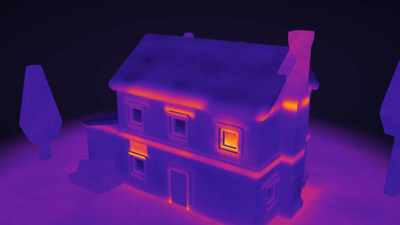
This is what a 3D heat map looks like: findings sit where they really are on the model, you can walk around them, and each one comes with a cause and a typical fix. The house is only an easy-to-read illustration.
Example / illustration

Example – illustration. Open-licence (CC0) 3D model and a simulated temperature distribution. Not a real client, not a real measurement.

01 / Interactive model

Rotate it, switch it, “measure” it

Switch between thermal, visual and findings views. Hover (or tap) a surface and the model shows its simulated surface temperature.

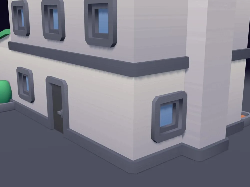
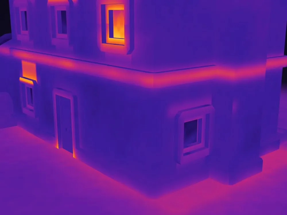
A family house 3D model with a simulated heat map: walls are dark purple–blue, while window frames, the eaves and the slab edge show as warmer yellow–orange bands.

Example – simulated

Rotatable, with temperature read-out

Simulated surface temperature

Pick a finding from the numbered pins or from the list.

  1. 1 Window lintel thermal bridge Warm stripe above the opening
  2. 2 Roller-shutter box Uninsulated box above the window
  3. 3 Plinth and slab edge Warm line along the slab and the ground
  4. 4 Eaves junction Broken insulation where roof meets wall
  5. 5 Leaky window Draughty window unit

Drag to rotate, scroll to zoom. Move the pointer over a surface to read its simulated temperature.

Assumptions: outdoor air 0 °C, indoors 20 °C, night-time, no wind, dry surfaces. The temperature field is a simulation, not a measurement.

Glass looks cold: it reflects the night sky, so the camera does not show its true surface temperature. For windows we assess the frame and the edges, not the glass.

02 / Why 3D?

What is a 3D heat map – and why is it more than a pile of photos?

A single thermal image shows one plane at one moment. A facility survey produces dozens of them. A 3D heat map projects them onto one model that follows the real geometry, so findings are tied to a place and to dimensions.

  • 01

    The finding is where it is

    Not “on the right of the third photo”, but at a given point of the facade, just above the slab. A maintenance person or contractor finds it in minutes.

  • 02

    Length and area can be measured

    If a thermal bridge is a line, you read its length; if it is a patch, its area. That turns into an estimated loss and then a cost estimate – always with stated assumptions.

  • 03

    Before and after can be compared

    A survey after the repair goes onto the same model, so you see what changed and what did not – and both states can be shown side by side.

  • 04

    One shared picture for decision-makers and specialists

    An overview for management, detail for the engineer: the same model at different depth. The priority list (A/B/C) sits next to it.

Photo folder compared with a 3D heat map
Question Folder of images3D heat map
Where is the defect? By photo number and description On the model, in place
How long / how large is it? Has to be estimated Measurable from the model
Comparable after the repair? Image by image, awkward On the same model
Hand-over to a contractor? Folder + explanation Link + findings list

03 / Findings

The five findings – and what they mean

Each finding comes with a visual view and a thermal view from the same viewpoint. The thermal views were rendered from simulated data.

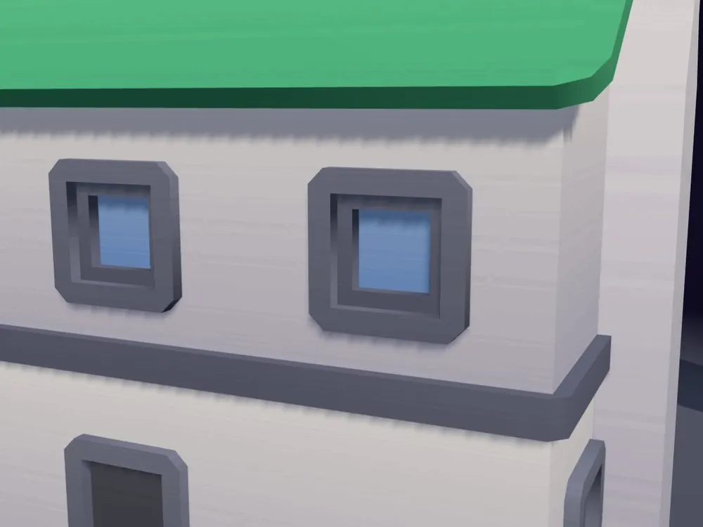
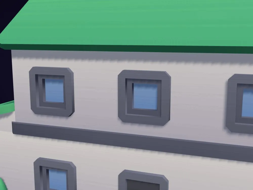
Window lintel thermal bridge – visual
Visual
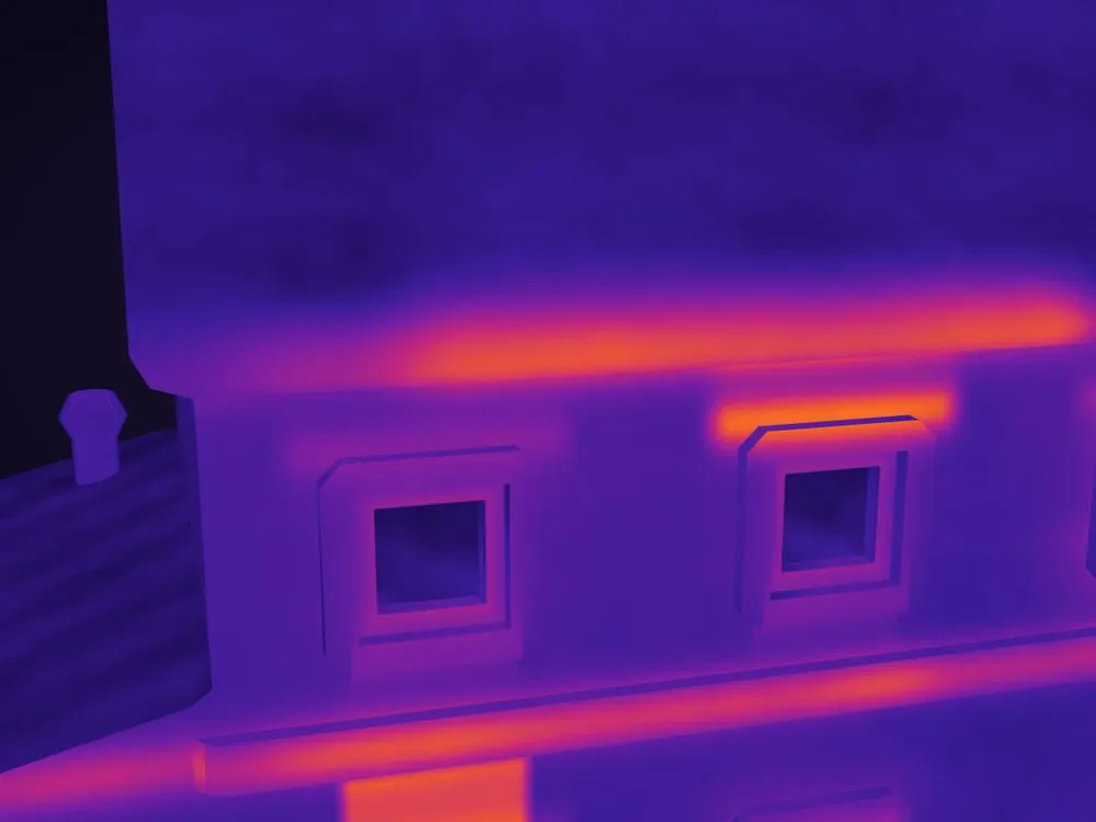
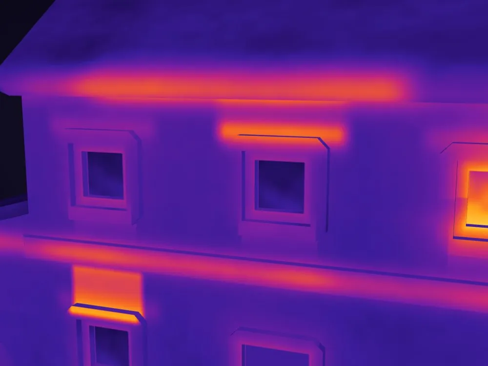
Simulated thermal image: a warm orange band above an upper-floor window on the facade.
Thermal (simulated)

Hottest point (simulated): ≈ 8.3 °C

Window lintel thermal bridge

Relevance in this example: Medium
What we see
A warm band, wider than the window, runs along the wall above the opening.
Why it happens
The lintel (concrete or steel) conducts heat many times better than the surrounding masonry or insulation. Indoors the surface along this line is colder, outdoors warmer – the same line can cause condensation and mould inside.
Typical fix
Continuous external insulation over the lintel, insulated lintel units or cover insulation around the opening; thermally broken fixings.
Relevance
Small area but easy to pin down; because of the mould risk it is often more important than the heat loss alone.
Show on the 3D model
Roller-shutter box – visual
Visual
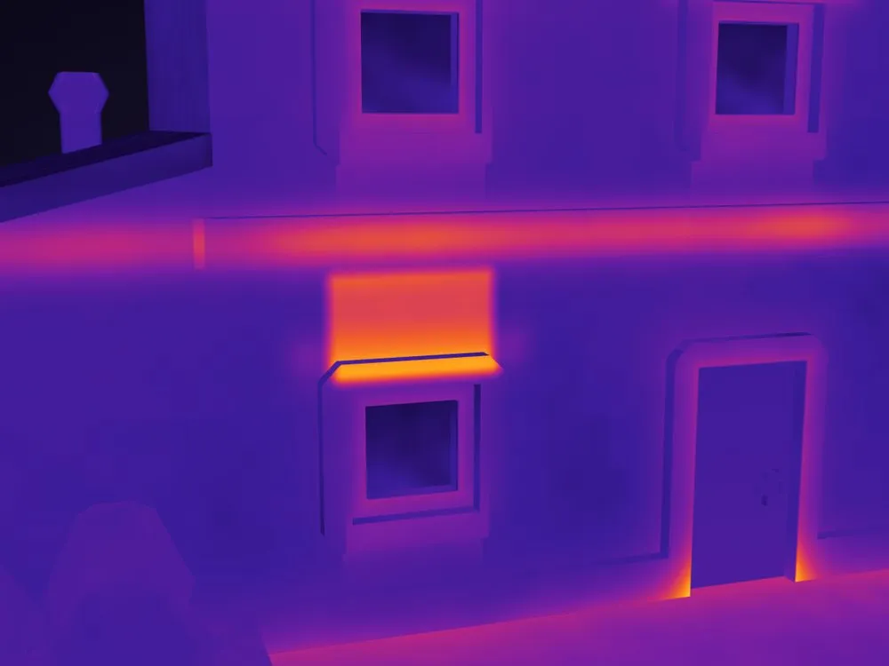
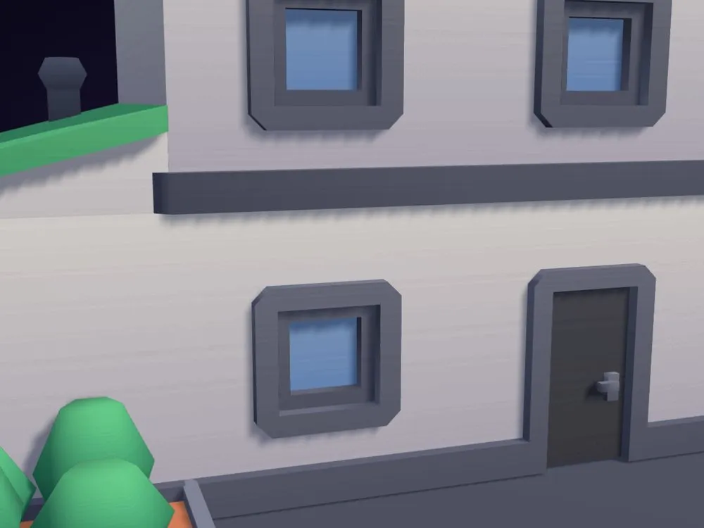
Simulated thermal image: a sharp-edged warm rectangle above the ground-floor window.
Thermal (simulated)

Hottest point (simulated): ≈ 7.6 °C

Roller-shutter box

Relevance in this example: Medium
What we see
A sharp-edged, evenly warm rectangle above the window – the shutter box.
Why it happens
The box sits inside the wall thickness, often separated from the room by only a thin sheet or foam, and its service hatch is not airtight. That is a thermal bridge and an air leak in the same place.
Typical fix
Insulated shutter box or retrofit insulation insert, an airtight service cover, sealing the junction between box and opening; in extreme cases an external front-mounted shutter.
Relevance
Common and easy to identify; the effect adds up with the number of windows. Often fixed with a modest intervention.
Show on the 3D model
Plinth and slab edge – visual
Visual
Simulated thermal image: a warm horizontal band at the storey slab and along the base of the house.
Thermal (simulated)

Hottest point (simulated): ≈ 7.1 °C

Plinth and slab edge

Relevance in this example: High
What we see
A patchy warm line runs round the building at the floor-slab level and along its base.
Why it happens
The slab projects through the insulation, and at the plinth the insulation is thin or missing. Heat escapes through the slab edge and the wall in contact with the ground; cold floor and wall corners remain inside.
Typical fix
Continue the facade insulation down the plinth below ground level, cover the slab edge, take special care at corners.
Relevance
A long repeating line – its length can be measured directly in the 3D model. Affects comfort as well as mould risk.
Show on the 3D model
Eaves junction – visual
Visual
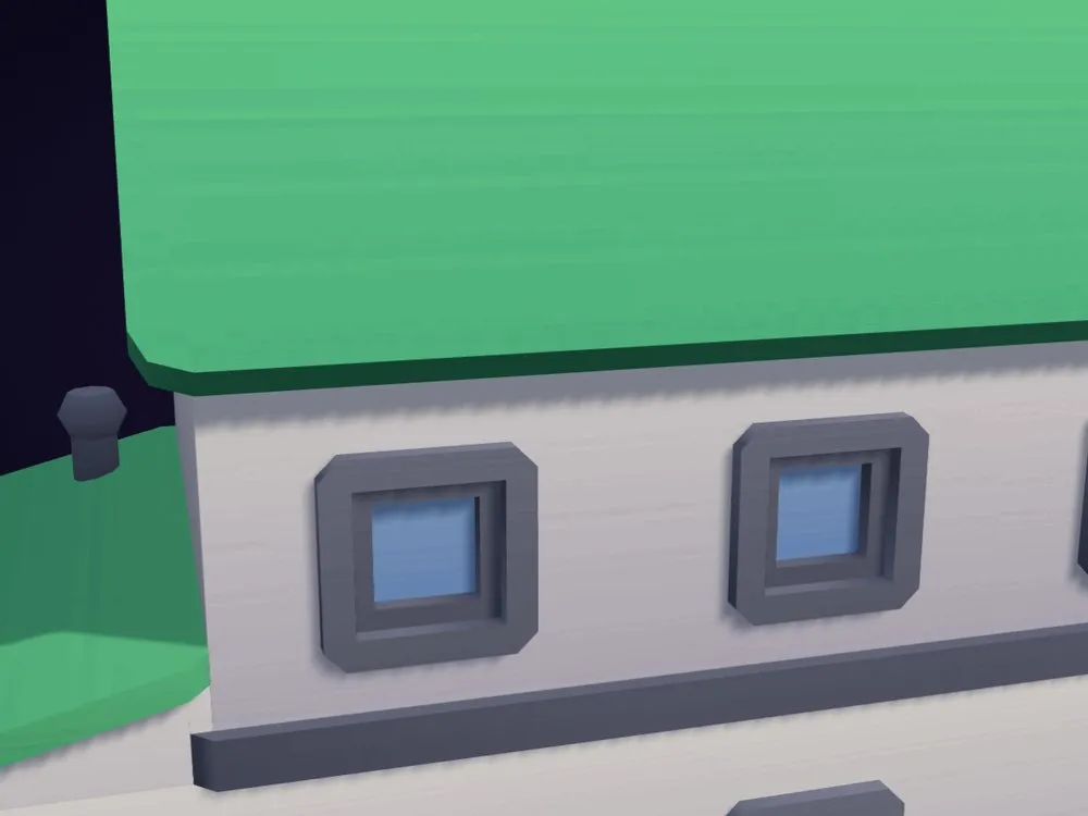
Simulated thermal image: a patchy warm band under the eaves with a cold roof above.
Thermal (simulated)

Hottest point (simulated): ≈ 8.8 °C

Eaves junction

Relevance in this example: Medium
What we see
Patches of warm band where the wall meets the roof, while the rest of the roof stays cold.
Why it happens
The attic or roof insulation ends here and meets the wall insulation: the overlap is often incomplete, the ring beam is a thermal bridge, and warm air leaks out through the eaves (stack effect).
Typical fix
Make roof and wall insulation continuous with an overlap, add an air barrier at the eaves while keeping the ventilation, cover the ring beam.
Relevance
Rising warm air usually makes the effect larger than the narrow band suggests.
Show on the 3D model
Leaky window – visual
Visual
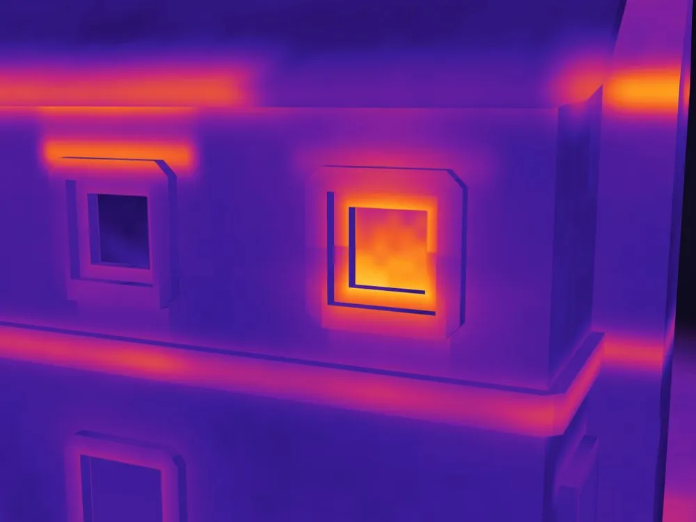
Simulated thermal image: a strongly warm window frame with yellow-white corners and a warm plume above it.
Thermal (simulated)

Hottest point (simulated): ≈ 11.6 °C

Leaky window

Relevance in this example: High
What we see
One window frame and its lower corners are conspicuously warm, with a warm plume above the frame.
Why it happens
A dried-out or displaced seal and badly adjusted hardware let warm indoor air escape through the gap (and cold air flow in). The outlier surface temperature along the frame line is the sign.
Typical fix
Replace the seal, adjust the hardware; if the unit cannot be repaired, replace the window. Verify from inside with smoke or an air-tightness test.
Relevance
A common and well-fixable finding; the loss depends on the temperature difference and the size of the gap.
Show on the 3D model

Illustrative example – not real measurement data.

The relevance rating and the temperature values come from the simulation of this example.

04 / Real images

Real thermal images of similar defects

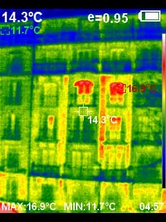
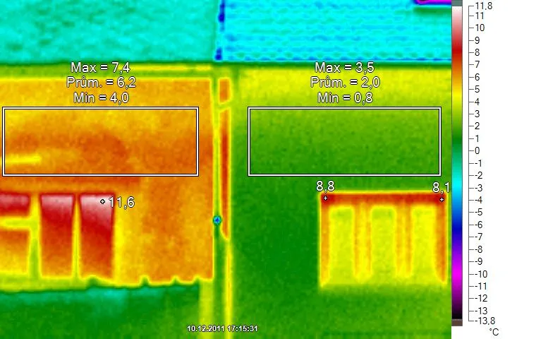
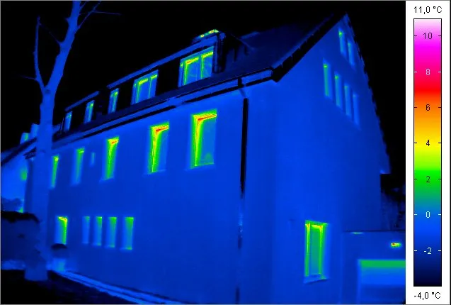
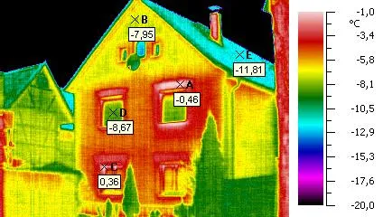
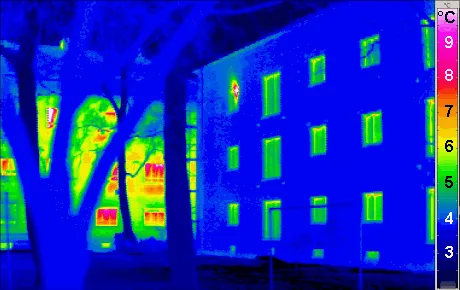
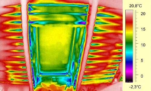
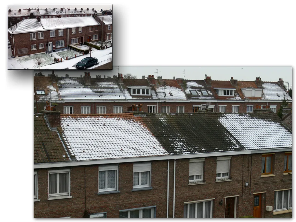
The model above is simulated. The images below are real thermal images under open licences – not our own survey images and not our clients. They are shown unmodified (resized for the web) with source and licence details.

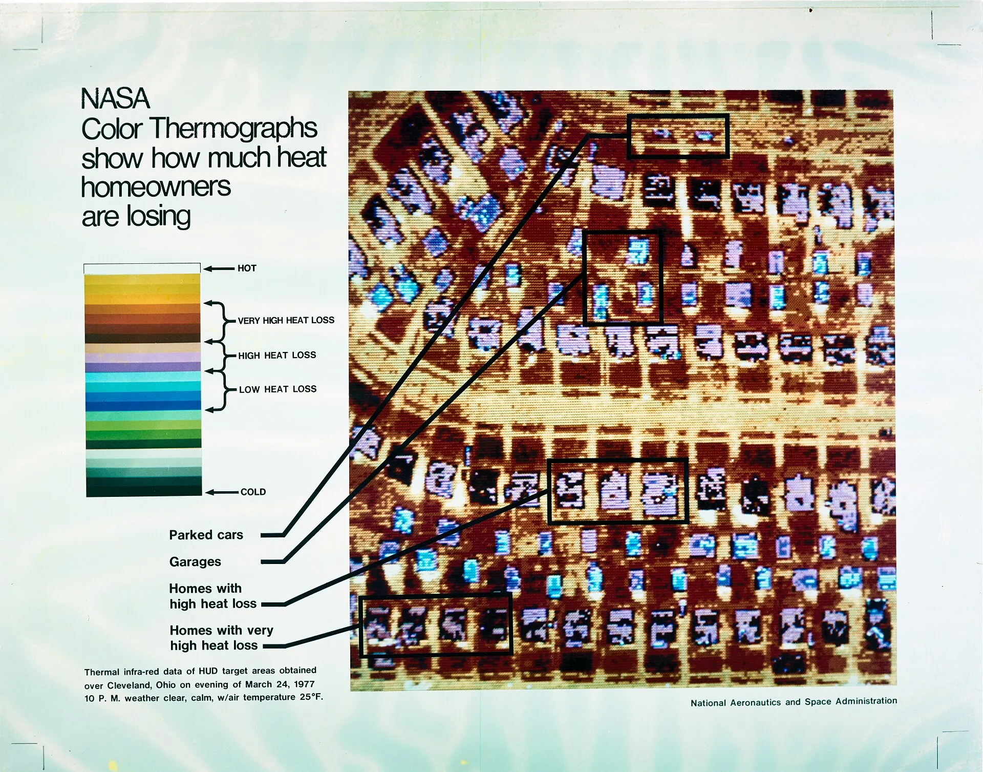
The 1977 NASA poster: a night-time thermal scan of a Cleveland residential district with colour-coded heat loss and explanatory text.
Image: “COLOR THERMOGRAPH SHOWING HEAT LOSS - NARA - 17419418” – NASA / U.S. National Archives (NARA ID 17419418), Public Domain / Wikimedia Commons

A historic note: 1977, Cleveland

On the night of 24 March 1977 NASA flew a thermal survey over a residential district of Cleveland, Ohio. The poster colour-codes the heat escaping from roofs – so looking for heat loss is an old method. What has changed is how images are captured, registered onto a 3D model and handed over.

05 / Honestly

We work with facilities – the house is only an example

HőKép3D works with business customers: warehouses, halls, shops, wineries, cold stores and institutions. The family house is here because everyone knows these defect types, and one model quickly shows what a 3D heat map is. We do not offer a service to households.

The logic is the same, only the defects have different names: dock-door seals, sandwich-panel joints, ridge, column bases, cold-room junctions. This page is not an offer and not the result of a real measurement.

  • Warehouse, hall

    Dock doors, gates, roof and wall panel joints.

  • Cold store, cellar

    Cold-room junctions, door seals, floor edge.

  • Roof, solar

    Wet insulation, thermal bridges, faulty cells (subject to airspace permission).

Curious where heat escapes from your facility?

Request a quote: we survey at night, register the images on a 3D model and rank what to fix first. Numbers are estimates, not guarantees.

Credits and sources

The 3D model and the images on this page are under open licences; thanks to their authors.

  • 3D models: City Kit (Suburban) 2.0 by Kenney (www.kenney.nl), CC0 1.0 – kenney.nl/assets/city-kit-suburban · CC0 1.0
  • The temperature distribution is HőKép3D’s own simplified simulation; the model colouring and the findings were made by us.
  • 3D rendering: three.js (MIT licence).

Real thermal images and photographs

Images are shown unmodified, resized for the web.